Product Page
Product Page
The product page is where customers can view detailed information about a specific product, and decide whether to buy it. This section provides an overview of the main elements of the product page layout, and explains where to customize their appearance.
The product page is divided into the following areas:
- Product Image: The main product image is usually displayed at the top of the page, below the header.
- Product Information Block: Typically displayed on the right side of the page, this block usually includes the product's description, variants, and any other relevant information.
- Product Name and Options Block: Typically displayed on the left side of the page, this block usually contains the product's name, price, and options to add the item to the cart.
Product Page Configuration
Click the dropdown at the top of the page, and select Products > Default product. This will load the "Default Product" settings where you can then make customizations.
In Product Information, configure the display settings as follows:
- Sticky Content on Desktop: Enable this to keep the product information section fixed on the screen while scrolling on desktop.
- Sticky Add to Cart: Enable this to display the "add to cart" section at the bottom of the page when scrolling down.
- Image Style:
- Cover: The product image will fill the entire frame, potentially cropping the image to maintain the aspect ratio.
- Contain: The product image will be displayed fully within the frame, maintaining all its details.
- Tab Description: The content displayed in the tab description is automatically pulled from the product description you created in the Shopify admin. This is usually displayed below the product's information, as an accordion section.
- Lightbox: Enable this to allow users to view a larger version of the product image when they click on it.
- Desktop Column: Set the number of columns for this section to display on desktop screens.
- Tablet Column: Set the number of columns for this section to display on tablet screens.
- Mobile Column: Set the number of columns for this section to display on mobile screens.
Customize the Tab Description: The content displayed in the "Description" tab is automatically pulled from the product description you created in your Shopify admin.
Customize the Tab Custom: You can use this option to add additional information about the product, that doesn't fit the other tab options:
- Heading: Enter the title for the custom tab.
- Content: Enter the content you want to display on the tab.
Customize the Size Chart:
- Title: Enter the title for the size chart tab.
- Set up a Size Chart:
- First, create a Size Chart page by going to Online Store > Pages in your Shopify Admin and creating a new page for your size chart.
- Then, go to Products in your Shopify Admin and select the product you want to customize.
- Scroll down to the Product Metafields section, and select the size chart page you created.
Complementary Products
- Heading: Enter a title for the complementary products section.
- Maximum Products to Display: Set the maximum number of complementary products that will be displayed and the number of products to display per row.
To select products for display:
1. Go to Products in your Shopify admin.
2. Select the product you want to customize.
3. Scroll down to the Product Metafields section.
4. Select the products you want to display under Complementary Products.
Customize the Icon with Text Section
- Heading: Enter the title for this section.
- Image: Choose an image for display on this section.
Related products
Customize the Related Products Section: The related products section displays a slider of similar products,
- Heading: Enter a title for the related products section, and choose its size.
- Description: Add an optional description if needed.
- Maximum Products to Show: Set the maximum number of related products that will be displayed, or leave it as default to display a pre-defined amount.
- Number of Columns: Select the number of columns for the related products to be displayed on the screen. This number will change depending on the screen size (desktop, tablet or mobile).
Product labels:
Note that product images can also display labels such as "New", "Sale", and "Best Seller", which can be configured in the Theme Settings > Product Label section, as explained in the previous sections of this guide.
New label:
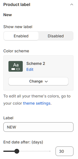
- Show New Label: Toggle this setting to enable or disable the "New" label on product images. When enabled, products recently added to your shop will display a "New" label in the top-left corner of the image.
- Color Scheme: Select the desired color for the "New" label.
- Label: Customize the text displayed on the label (e.g., "New Arrival", "Just In").
- End Date After: Specify the number of days a product will display the "New" label after being added to your shop.
Sale label:
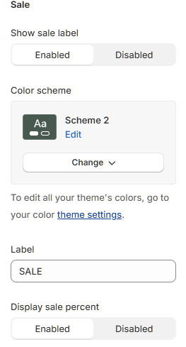
- Show Sale Label: Toggle this setting to enable or disable the "Sale" label. When enabled, products with a reduced price (compared to their original price) will display a "Sale" label in the top-left corner of the image.
- Color Scheme: Select the desired color for the "Sale" label.
- Label: Customize the text displayed on the label (e.g., "Sale!", "Discounted").
- Display Sale Percent: Toggle this setting to enable or disable the display of the price difference as a percentage on the sale label. If disabled, only the "Sale" label will appear.
Best-seller label:
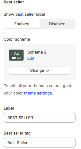
- Show Best Seller Label: Toggle this setting to enable or disable the "Best Seller" label. When enabled, a "Best Seller" label will appear on qualifying product images.
- Color Scheme: Select the desired color for the "Best Seller" label.
- Label: Customize the text displayed on the label (e.g., "Top Seller", "Popular").
- Best Seller Tag: Enter a tag name (e.g., "bestseller"). Then, to display the "Best Seller" label on a specific product, go to the product page and add this tag in the "Tags" field.
Related Articles
Compare Page
A Compare Page allows customers to view a comparison of different products in your store. Customers can add products to the comparison list by clicking the compare icon (two opposite arrows ?) on the product image. With each product image, when ...Collections Page
Collections List Page The Collections List Page displays all of your store's collections in a list format. Customize Collections list page From your Shopify admin, go to Online Store > Themes. Click on Customize on the theme you want to edit. On the ...Home Page
Understanding Sections and Blocks Sections are the building blocks of your store's layout in Shopify, providing a flexible way to arrange content on each of your store's pages. Accessible from the left-side menu in the Theme Editor, sections are made ...Product Information
This section allows users to display detailed information about a single featured product, including an image and link. It is divided into three columns on the homepage. Configure as follows: Section Layout: Color Scheme: Select a background color to ...Product Live
This section enables users to showcase product videos on the homepage. When clicking on an image or the "watch now" button, the video is displayed in the center of the screen, with the related products on the right. Configure the following: Section ...