Gallery Slider
The Gallery Slider section, typically located on the homepage, displays a series of images and accompanying text in a slideshow format. It's a visually engaging way to showcase products, promotions, or other key information.
Accessing Gallery Slider Settings:
On the theme customization page:
- Click the first icon to access section settings.
- Click "Gallery slider" on the setting bar, or click directly on the Gallery Slider display on the page.
Configuration Options:
Section Header:
- Heading: Enter the main title for the section.
- Heading Size: Select the desired display size for the title.
- Sub-heading: Enter a secondary heading (optional).
- Description: Enter a detailed description of the section.
- Alignment: Choose the alignment of the displayed information (heading, subheading, description).
- Button Label: Enter the text for the button.
- Button Link: Select the URL that the button will link to.
- Choose whether to open the link in a new window or the current window.
Section Body:
- Image Ratio: Set the desired display ratio for images within the slider.
- Speed (Seconds): Set the duration (in seconds) for each slide transition.
Section Footer:
- Button Label: Enter the text for the button.
- Button Link: Select the URL that the button will link to.
- Choose whether to open the link in a new window or the current window.
Section Layout:
- Color Scheme: Select a background color to use if no background image is displayed.
- Background: Choose a background image for the section (if desired).
- Section Full Width: Toggle this setting to make the section span the full width of the screen. If disabled, customize the size at "Section max width."
- Content Full Width: Toggle this setting to make the content within the section span its full width. If disabled, customize the size at "Content max width."
- Padding and Margin: Adjust the padding and margin for the section on mobile, desktop, and tablet screens to control spacing.
- Section Optimize: Lazy Load Speed: The section will only load when it is scrolled to on the page, improving initial page load times.
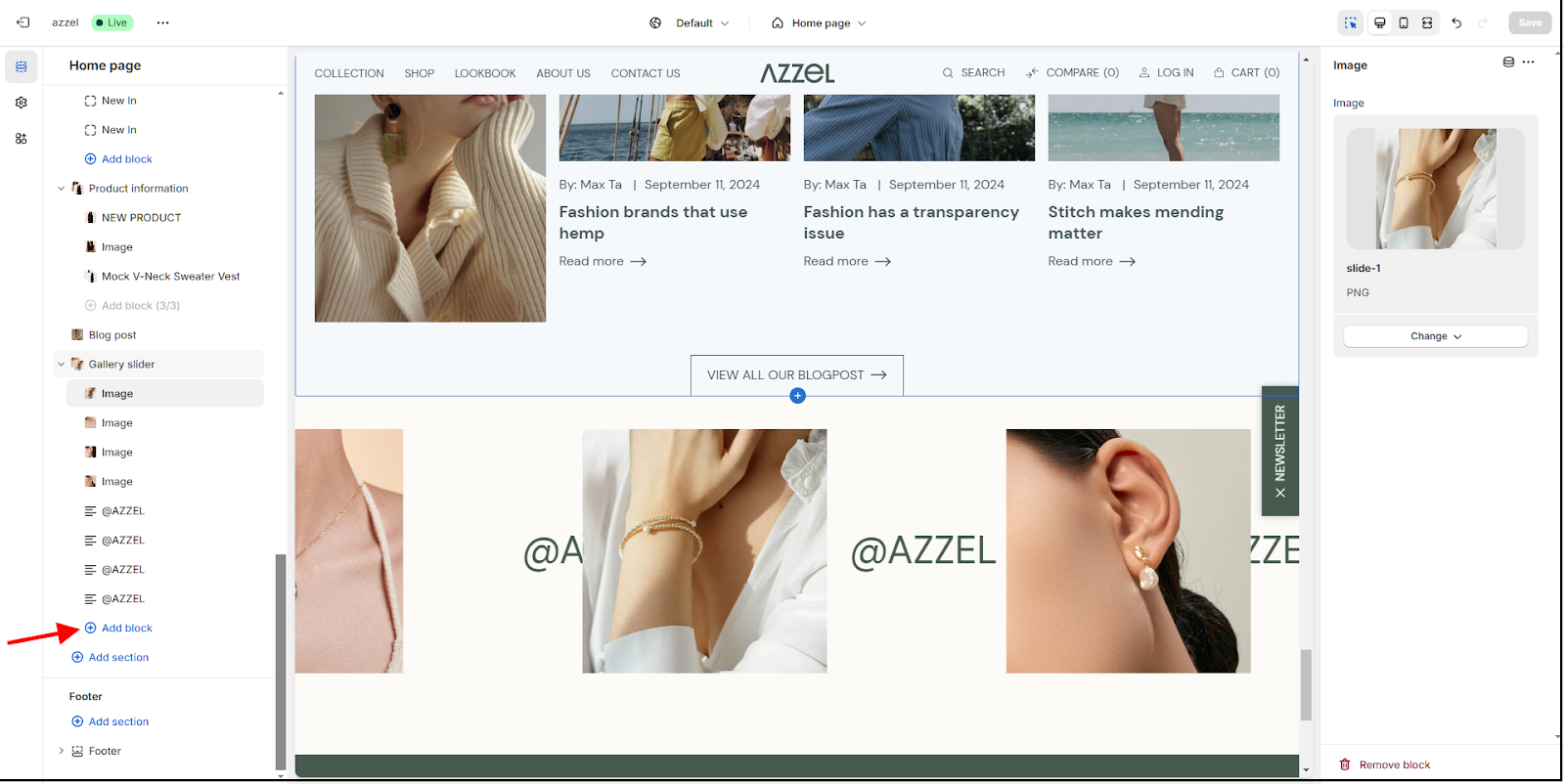
- To add a block to the Gallery Slider, click "Add block" and select "Image and Text." You can then choose an image and enter a title for that slide.
Related Articles
Lookbook slider
The Lookbook Slider section displays a main lookbook image on the left side of the screen, while the right side shows products from the lookbook as a slide. Configure this section as follows: Section Header: Heading: Enter the title. Heading Size: ...Customizing the Anysound Preset - Azzel Theme
Anysound is the third preset in the Azzel theme. Anysound blends art, design, and performance — a gallery-inspired Shopify preset with elegant layouts, mobile speed, SEO, and effortless shopping. Before configuring the Anysound preset, please read ...Image Comparison
The Image Comparison section allows you to compare two products using an interactive slider. This section displays two images side-by-side with a slider in the middle. Customer can use the slider to compare two images side-by-side. Section Header: ...Customizing the Docket Preset - Azzel theme
Docket is the fourth preset in the Azzel theme. Docket transforms your Shopify store with modern professionalism — fast, responsive layouts for intuitive shopping, lasting impressions, and confident conversions. Before configuring the Docket preset, ...Marquee Text
This section allows you to display featured titles in a sliding format, highlighting key information or promotions on your page. General Settings: Select font display size: Choose the desired font size for the featured titles. Select number of ...