Speedy Theme Sections / Home Page
Themes use Sections to create your ideal layout, accessible from the left-side menu in the Theme Editor. Most sections are made up of blocks that serve a specific function, such as header, footer, single images, a collage of images, or links. Using sections and blocks in your templates provides more flexibility in how you arrange your store's content, enabling you to control the look and feel of your online store without the need to edit code. Each template can have up to 25 sections.
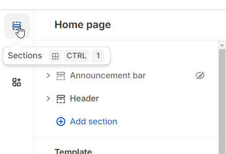
I. Header
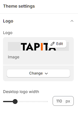
1. Logo
In the Logo, you can upload your business's logo to your online store and customize it through the size, position, and styling to ensure it complements your overall store design. Your logo shows in areas:
Header across all pages
Password page
Logo images can reach up to 300 px of width.
How to customize your logo
From your Shopify admin, go to Online Store > Themes.
Find the theme that you want to edit, and then click Customize.
Click Theme settings.
Click Logo.
In the Logo area, click Select image, and you have 03 options:
To use an image that you have already uploaded to your Shopify admin, click an image to select it and then click Select.
To use an image from your local computer, click Upload. Choose an image from your computer and click Open to start the upload. It will be automatically selected when the upload is finished. Click Select.
To select a free image, click Explore free images and search for or click an image to select.
Add alt text to your logo image:
1. Click Edit alt text.
2. In the Edit image window, enter a brief description of the image.
3. Click Save.
How to customize your logo width
Click Theme settings.
Click Logo.
In the Desktop logo width area, toggle the slider to the pixel width you want.
2. Header top:
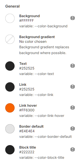
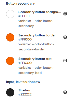
In this section, you can simply choose the theme color as well as the text color.
Choose a premade Color scheme.
Or you can edit your theme's colors by selecting theme settings - Add Scheme. Here you can customize the color scheme in sections such as:

You can update featured titles at Header top text, or can leave it blank.
In the Language selector, you can set the display of language and region/country code options right at the top of the page by checking Enable country/region selector and Enable language selector.

3. Menu items
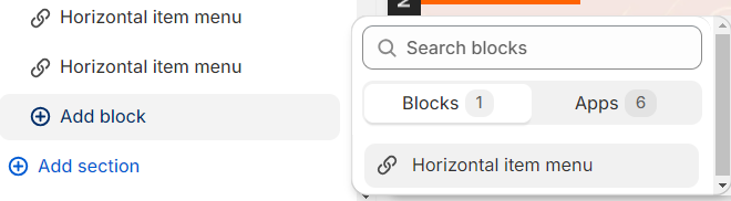
To have a menu displayed in the Header, you first need to do the following:
Click Add block
Click Horizontal item menu
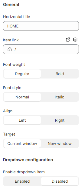
At the selected Horizontal item menu, you need to fill in the title for the menu at the horizontal title. And you can adjust the font weight and font style for that title. In addition, menu items can be displayed on the left or right by adjusting Align left or right.
In order for the menu to open a link when clicking on it, you need to insert a link to that menu by entering any link in the Item link, or choose the link leading to specific pages, blogs or collections and products available on webstores. And when the link opens, whether it will be displayed in a new window or the current window, you can select Current window or New window in the Target section.
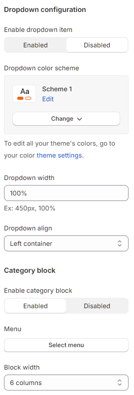
At Dropdown configuration, you can customize the display of menu items in dropdown format by selecting Enable and Disable in the Enable dropdown item section.
Then you can choose to customize:
Dropdown color scheme - menu item color displayed when hovering the mouse.
Dropdown width - size displayed.
Dropdown align - display left and right on the theme.
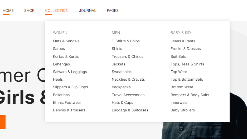
For categories to display in the menu, you first need to select “Enable” or “Disable” in the Enable category block section. Then select the menu to be displayed.
To create a menu, at the online store, click on Navigation and select Add menu.

After creating and selecting a menu, you can customize Block width from 1 to 6 in column, and Category column from 1 to 6.
You can also choose to display the image, image link and description, width in column format for each Top block and Bottom Block.

II. Template
Tapita - Slidershow
You can customize the color scheme for the slide, and then choose “Enabled” or “Disabled” in the sections under the Slider configuration such as:
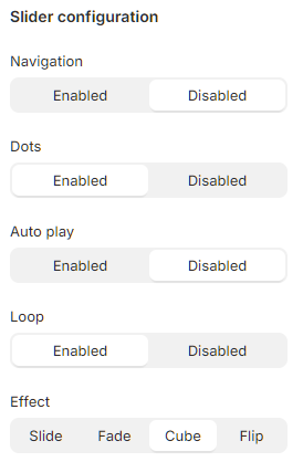
Section explanation:
Navigation: navigate to another page.
Dots: displayed for the number of sliders created, you can move sliders by clicking on each dot.
Auto play: Slider moves automatically.
Loop: Slider moves in a loop.
Effect: customize the slide transition effect such as: Slide, Fade, Cube, and Flip.
Next, you move on to customize the configuration in the Section configuration section, choosing "Enabled" or "Disabled" for the following items:

Section explanation:
Section lazyload - lazy loading speed (a section will only load on the page when you scroll down to that section).
Section max width: Width of section, if you choose “Disabled”, will default to the entire desktop with a size of 1830px. If you choose “Enabled”, you can customize the desired display size in Content max width.
To adjust the size between sections on the page, you need to customize the size on the desktop screen in Desktop vertical spacing and Desktop margin bottom.
However, because the display sizes on the screens will be different, you need to align the sizes for tablet and mobile screens in Tablet, mobile vertical spacing and Tablet, mobile margin bottom.
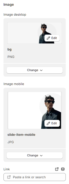
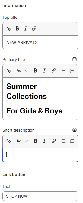
You go to Add Slide item, and then select the image for the slide displayed on desktop and mobile. You can customize information displayed on slides such as:
Top title
Primary title
Short description
Text in the link button
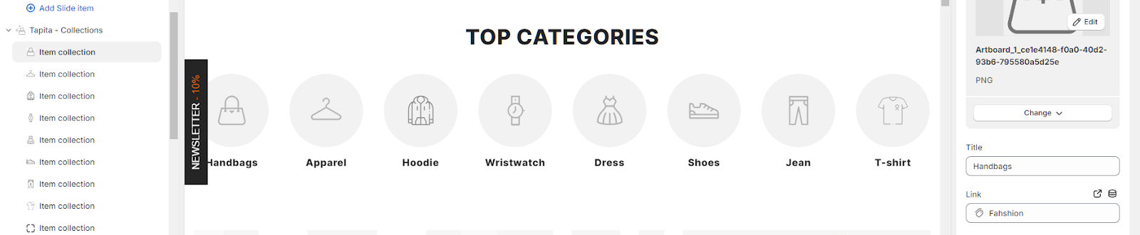
Tapita - Collections
Collection is displayed in Top Category - a slider format, and you need to customize this slider format in Slider configuration. However, here the effect options will not be displayed like a slidershow.
You can customize the color scheme for the slide by choosing “Enabled” or “Disabled” in the sections under the Slider configuration such as:
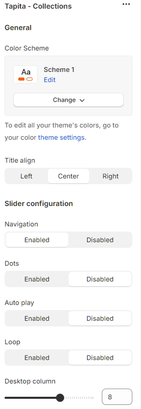
Section explanation:
Navigation: navigate to another page.
Dots: displayed for the number of sliders created, you can move sliders by clicking on each dot.
Auto play: Slider moves automatically.
Loop: Slider moves in a loop.
And select the number of columns to display categories on desktop, mobile, and tablet in Desktop column, Tablet column, and Mobile column.
Next, you move on to customize the configuration in the Section configuration section by choosing "Enabled" or "Disabled" for the following items:
Section explanation:
Section lazyload - lazy loading speed (a section will only load on the page when you scroll down to that section).
Section max width: Width of section, if you choose “Disabled”, will default to the entire desktop with a size of 1830px. If you choose “Enabled”, you can customize the desired display size in Content max width.
To adjust the size between sections on the page, you need to customize the size on the desktop screen in Desktop vertical spacing and Desktop margin bottom.
However, because the display sizes on the screens will be different, you need to align the sizes for tablet and mobile screens in Tablet, mobile vertical spacing and Tablet, mobile margin bottom.
How to add Collection section:
In Tapita - Collection, select Add block - title and fill in the title.
Align in the Title Align - Left, Center, Right section.
Select Add block - item collection.
Select image and fill in title for item.
Select link selection for item.
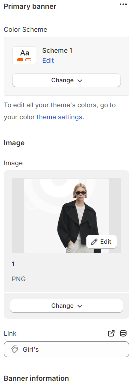
Tapita - Group banners
Group banner is divided into 2 parts: Primary banner - 1 banner on the left side of the screen, and Secondary banner - a block of banners including 3 smaller banners on the right side of the screen.
How to create a title for the Group banner:
In Tapita - Group banner, select Add block - title and fill in the titles.
Align in the Title Align - Left, Center, Right section.
Next, you move on to customize the configuration in the Section configuration section by choosing "Enabled" or "Disabled" for the following items:
Section lazyload - lazy loading speed (a section will only load on the page when you scroll down to that section).
Section max width: Width of section, if you choose “Disabled”, will default to the entire desktop with a size of 1830px. If you choose “Enabled”, you can customize the desired display size in Content max width.
To adjust the size between sections on the page, you need to customize the size on the desktop screen in Desktop vertical spacing and Desktop margin bottom.
However, because the display sizes on the screens will be different, you need to align the sizes for tablet and mobile screens in Tablet, mobile vertical spacing and Tablet, mobile margin bottom.
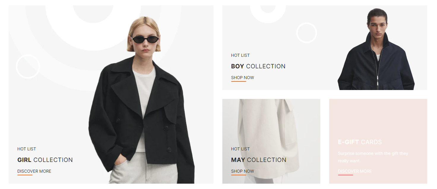
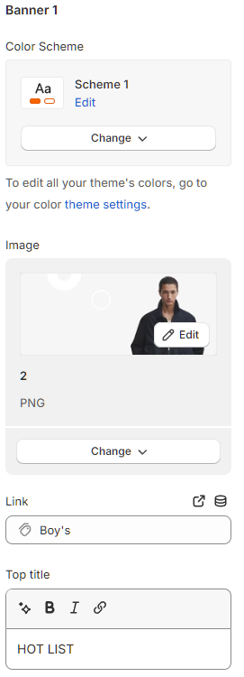
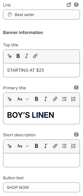
Primary banners:
Select a banner image (you are suggested to upload an image with dimensions of 690px x 600.3px to get the image to fit the banner frame like the demo image)
Paste a link to the image in the Link section.
Customize Banner information including:
Top title.
Primary title.
Short description.
Text in link button.
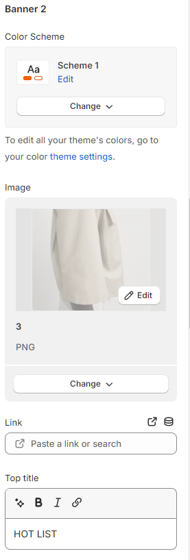
Secondary banner:
Select a banner image for each small banner.
The first banner image suggests you upload an image with dimensions of 690px x 284.97px to get the image to fit the banner frame like the demo image.
The other two banner images suggest you upload images with dimensions of 330px. x 284.98px to get the image to fit the banner frame like the demo image.
Paste a link to the image in the Link section.
Customize Banner information including: Top title, Primary title, Short description, and text in link button.
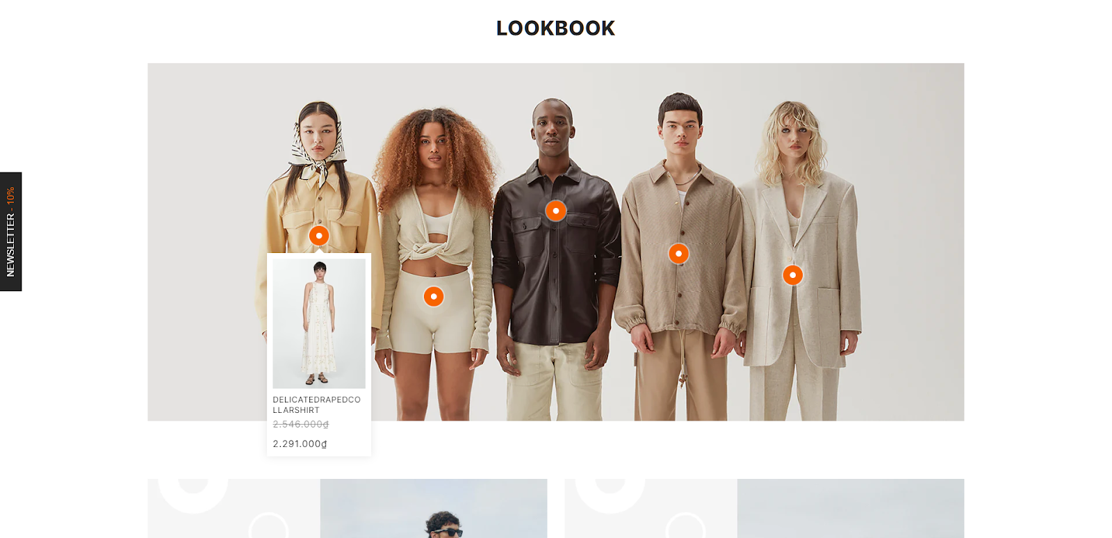
Tapita - Lookbook product
How to create a title for Lookbook:
In Tapita - Lookbook product, select Add block - title and fill in the titles.
Align in the Title Align - Left, Center, Right section.
Next, you move on to customize the configuration in the Section configuration section by choosing "Enabled" or "Disabled" for the following items:
Section lazyload - lazy loading speed (a section will only load on the page when you scroll down to that section).
Section max width: Width of section, if you choose “Disabled”, will default to the entire desktop with a size of 1830px. If you choose “Enabled”, you can customize the desired display size in Content max width.
To adjust the size between sections on the page, you need to customize the size on the desktop screen in Desktop vertical spacing and Desktop margin bottom.
However, because the display sizes on the screens will be different, you need to align the sizes for tablet and mobile screens in Tablet, mobile vertical spacing and Tablet, mobile margin bottom.
How to upload photos in Lookbook product:
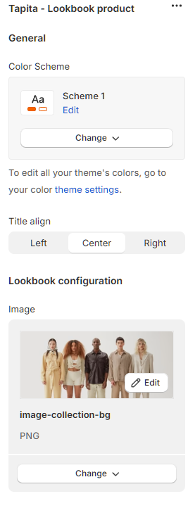
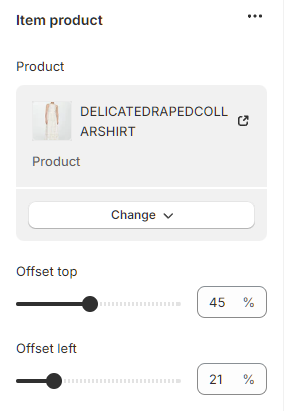
How to add item product:
Add block - Item product
Select the product to display
Set the position of the product displayed on the image in the Offset top and Offset left sections.
Tapita - Grid banners
How to create a title for Grid banner:
In Tapita - Grid banner, select Add block - title and fill in the titles.
Align in the Title Align - Left, Center, Right section.
Next, you move on to customize the configuration in the Section configuration section by choosing "Enabled" or "Disabled" for the following items:
Section lazyload - lazy loading speed (a section will only load on the page when you scroll down to that section).
Section max width: Width of section, if you choose “Disabled”, will default to the entire desktop with a size of 1830px. If you choose “Enabled”, you can customize the desired display size in Content max width.
To adjust the size between sections on the page, you need to customize the size on the desktop screen in Desktop vertical spacing and Desktop margin bottom.
However, because the display sizes on the screens will be different, you need to align the sizes for tablet and mobile screens in Tablet, mobile vertical spacing and Tablet, mobile margin bottom.
How to create Item banner:
Add block - item banner.
Select Banner image. You are suggested to upload photos with dimensions of 690px x 397.98px to get the image to fit the banner frame like the demo image.
Paste a link to the image or select the product or collection for the photo in the Link section.
Customize Banner information including: Top title, Primary title, Short description, and text button.

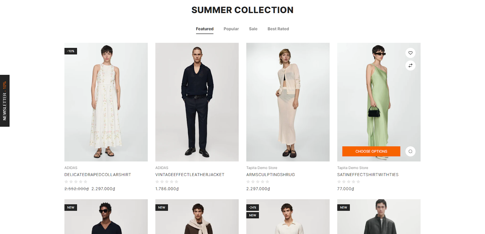
Tapita - Product slider
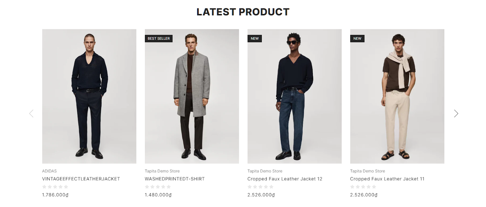
How to create a title for Product slider:
Add block - title and fill in the title.
Align in the Title Align - Left, Center, Right section.
In the product collection, select the collection already in the store.
Select the number of products displayed on the page in Limit.

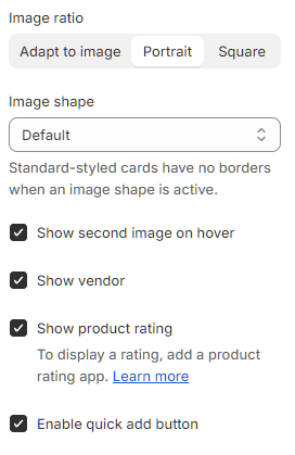
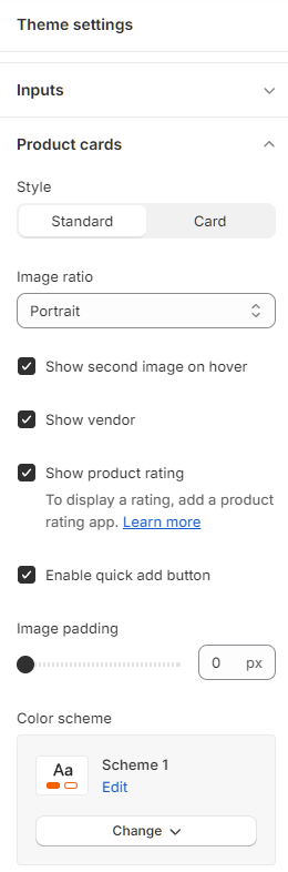
Customize the display of product images such as: Image ratio and Image shape.
Customize product information such as: product reviews, or another image displayed when hovering, etc.
Note: You can set the display of product details in theme settings. After setting in theme settings - all products in the store will be displayed in detail as set.
Product slider is displayed in columns on screens, so you need to adjust the number of columns displayed on desktop, tablet and mobile screens.
Product Slider is displayed as a slider; however, here the effect options will not be displayed like a slidershow.
You can choose "Enabled" or "Disabled" in the configuration in the Section configuration section for the following items:
Section lazyload - lazy loading speed (a section will only load on the page when you scroll down to that section).
Section max width: Width of section, if you choose “Disabled”, will default to the entire desktop with a size of 1830px. If you choose “Enabled”, you can customize the desired display size in Content max width.
To adjust the size between sections on the page, you need to customize the size on the desktop screen in Desktop vertical spacing and Desktop margin bottom.
However, because the display sizes on the screens will be different, you need to align the sizes for tablet and mobile screens in Tablet, mobile vertical spacing and Tablet, mobile margin bottom.
Tapita - Product tabs
How to create a title for Product slider:
Add block - title and fill in the title.
Align in the Title Align - Left, Center, Right section.
In the product tab, select the number of products to display on the page in Product Limit.
Select to display product images by custom image ratio and image shape.
Customize product information such as: product reviews, or another image displayed when hovering, etc.
Note: You can set the display of product details in theme settings. After setting in theme settings - all products in the store will be displayed in detail as set.
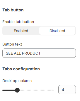
Tab button
For customers to see more products in your store collection, Select “Enabled” in Tab button and fill in Button text.
Select “Disabled” to disallow customers to view more products in the collection.
You can customize the configuration for Product tab in the Section configuration section by choosing "Enabled" or "Disabled" for the following items:
Section lazyload - lazy loading speed (a section will only load on the page when you scroll down to that section).
Section max width: Width of section, if you choose “Disabled”, will default to the entire desktop with a size of 1830px. If you choose “Enabled”, you can customize the desired display size in Content max width.
To adjust the size between sections on the page, you need to customize the size on the desktop screen in Desktop vertical spacing and Desktop margin bottom.
However, because the display sizes on the screens will be different, you need to align the sizes for tablet and mobile screens in Tablet, mobile vertical spacing and Tablet, mobile margin bottom.
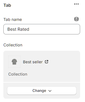
How to add Product tab:
Add block - tab.
Enter a name for the tab (Tab name).
Select collection for tab.
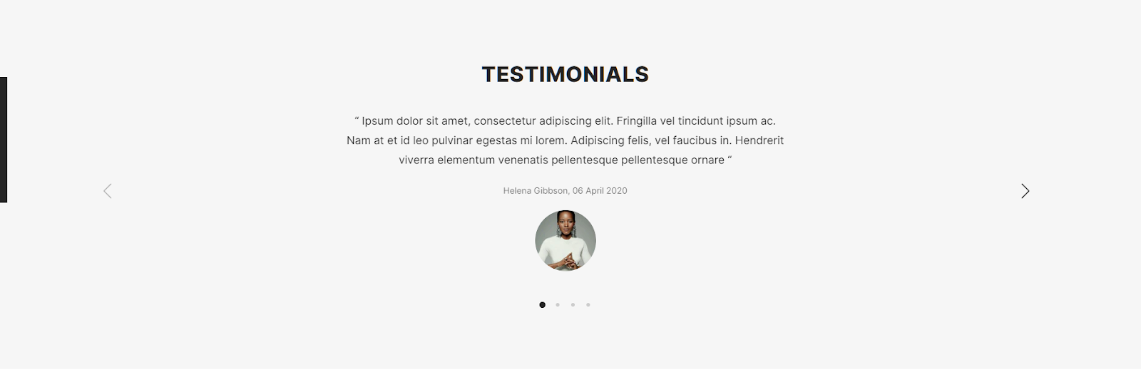
Tapita - Testimonials
How to create a title for Product slider:
Add block - title and fill in the title.
Align in the Title Align - Left, Center, Right section.
Testimonial shows in slider format; however, here the effect options will not be displayed like a slidershow. You need to choose “Enabled” or “Disabled” in the sections under the Slider configuration such as:
Navigation: navigate to another page.
Dots: displayed for the number of sliders created, you can move sliders by clicking on each dot.
Auto play: Slider moves automatically.
Loop: Slider moves in a loop.
You move on to customize the configuration for Testimonials in Section configuration by choosing "Enabled" or "Disabled" for the following items:
Section lazyload - lazy loading speed (a section will only load on the page when you scroll down to that section).
Section max width: Width of section, if you choose “Disabled”, will default to the entire desktop with a size of 1830px. If you choose “Enabled”, you can customize the desired display size at Content max width.
To adjust the size between sections on the page, you need to customize the size on the desktop screen in Desktop vertical spacing and Desktop margin bottom.
However, because the display sizes on the screens will be different, you need to align the sizes for tablet and mobile screens in Tablet, mobile vertical spacing and Tablet, mobile margin bottom.
How to add Testimonials:
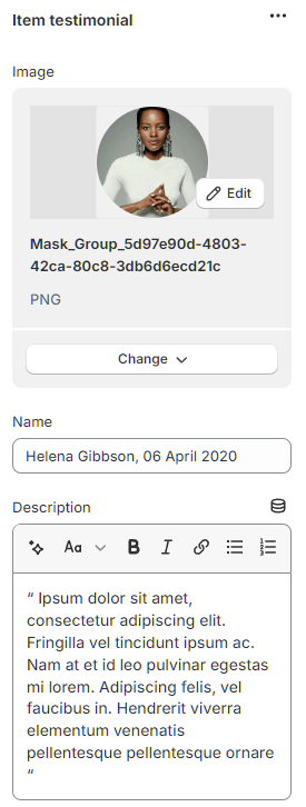
Add block - Item testimonial.
Select a photo for testimonial.
Fill in information in Name and Description.
Tapita - Services

How to create a title for Services:
Add block - title and fill in the title.
Align in the Title Align - Left, Center, Right section.
Select the number of columns to display the Item Services on desktop, mobile, and tablet at Columns number.
You can customize the configuration for Services in Section configuration by choosing "Enabled" or "Disabled" for the following items:
Section lazyload - lazy loading speed (a section will only load on the page when you scroll down to that section).
Section max width: Width of section, if you choose “Disabled”, will default to the entire desktop with a size of 1830px. If you choose “Enabled”, you can customize the desired display size in Content max width.
To adjust the size between sections on the page, you need to customize the size on the desktop screen in Desktop vertical spacing and Desktop margin bottom.
However, because the display sizes on the screens will be different, you need to align the sizes for tablet and mobile screens in Tablet, mobile vertical spacing and Tablet, mobile margin bottom.
How to add Services:
Add block - Item Services
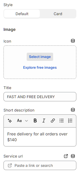
Choose style as default/card.
Select image as icon.
Fill in information in Title and Short description.
Enter the services URL link if available.
Tapita - Latest News
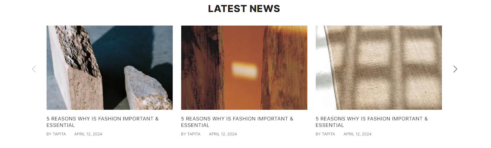
How to create a title for Latest News:
Add block - title and fill in the title.
Align in the Title Align - Left, Center, Right section.
In Blog, select the blog already in the store.
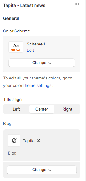
Select the number of blogs to display in Limit.
Blogs are displayed in columns, so you need to choose to display columns on desktop, tablet and mobile screens.
Blogs are displayed as a slider; however, here the effect options will not be displayed like a slidershow. You need to choose “Enabled” or “Disabled” in the sections under the Slider configuration such as:
Navigation: navigate to another page.
Dots: displayed for the number of sliders created, you can move sliders by clicking on each dot.
Auto play: Slider moves automatically.
Loop: Slider moves in a loop.
You move on to customize the configuration for Testimonials in Section configuration by choosing "Enabled" or "Disabled" for the following items:
Section lazyload - lazy loading speed (a section will only load on the page when you scroll down to that section).
Section max width: Width of section, if you choose “Disabled”, will default to the entire desktop with a size of 1830px. If you choose “Enabled”, you can customize the desired display size in Content max width.
To adjust the size between sections on the page, you need to customize the size on the desktop screen at: Desktop vertical spacing and Desktop margin bottom.
However, because the display sizes on the screens will be different, you need to align the sizes for tablet and mobile screens in Tablet, mobile vertical spacing and Tablet, mobile margin bottom.
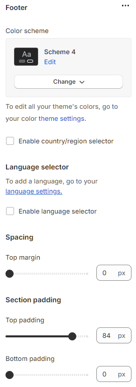
III. Footer
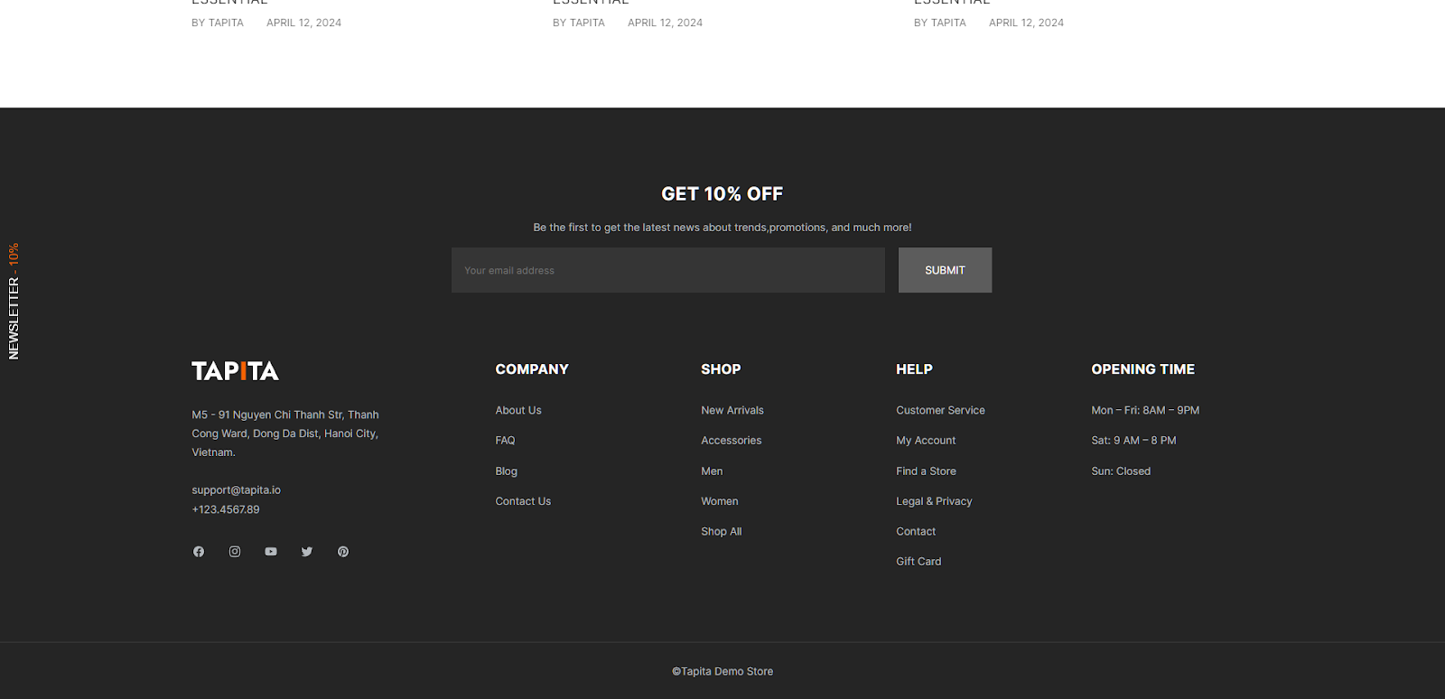
When customizing the Footer configuration, you can set the display of language options and region/country codes by checking Enable country/region selector and Enable language selector.
It is possible to adjust the distance between columns in the footer in Spacing and Section padding.
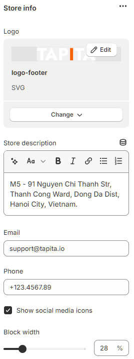
Store information
How to add store information:
Add block - store info.
Upload your logo.
Fill in store description, email address, and phone number.
Tick the box Show social media icons if necessary.
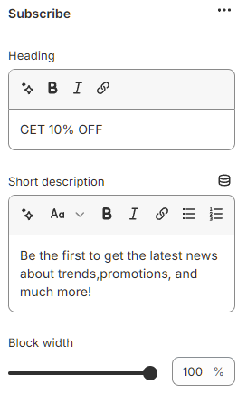
Subscribe
How to add Subscribe section:
Add block - subscribe.
Fill in Heading and Short description.
Menu
How to add menu:
Add block - menu.
Fill in Heading.
Select the created footer menu in the navigation.

Related Articles
Speedy Theme - About Page Config
1. To create an About Page, you need to do as follows: 1. Go to Online Store in Shopify 2. Access Pages 3. Click Add Page and enter a title 4. In Theme template, select about-us template 2. To configure About Page: Access Themes → Customize → Page → ...Speedy Theme Settings
You can utilize Theme settings to modify your storefront, accessible from the left-side menu in the Theme Editor. Easily adjust design elements like colors, layouts, fonts, buttons, and style. These changes will affect all templates uniformly. ...Speedy Theme - FAQ Page Config
To create a FAQ Page, you need to do as follows: 1. Go to Online Store in Shopify 2. Access Pages 3. Click Add Page and enter a title 4. In Theme template, select FAQ template To configure FAQ Page: Access Themes → Customize → Page → FAQ Tapita FAQ ...Speedy Theme - Contact Page Config
To create a Contact Page, you need to do as follows: 1. Go to Online Store in Shopify 2. Access Pages 3. Click Add Page and enter a title 4. In Theme template, select Contact template To configure Contact Page: Access Themes → Customize → Page → ...Speedy Theme - Product Page Config
To customize the Product page, you need to access Default product → Products. In Product Information, you can customize the display configuration: Check “Enable sticky content on desktop” to add sticky status to product information. Check "Enable ...