Customizing the Video Section
Video Section Overview
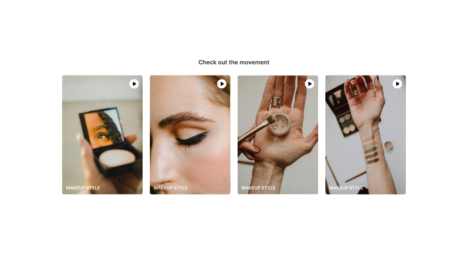
In Shopify stores, video sections are powerful tools for showcasing products, tutorials, testimonials, and more. Tapita's Video Section provides a dynamic hub for this multimedia content, offering users a rich and engaging experience through a wide array of video resources.
With Tapita's Video Section, you can:
- Showcase Educational Tutorials: Share how-to videos to educate your customers about your products.
- Offer Compelling Product Demos: Demonstrate the features and benefits of your products in action.
- Display Customer Testimonials: Build trust by featuring real customers sharing their positive experiences.
- Provide Entertaining Content: Add variety and engage visitors with entertaining video content related to your brand.
Video Section Configuration
For instructions on how to add a video section to your store, please refer to the Getting Started guide for Tapita Theme Sections Builder.
After adding your desired Video Section to your store, you can customize its content as follows within the Shopify Theme Editor:
Step 1: Under the Video section, click "Add video."
Step 2: Customize the video settings:
- Preview Video: Select an image to use as a preview thumbnail for the video.
- Main Video: Select the actual video file to play.
- Heading: Insert the heading text for the video.
- Subheading: Insert the subheading text for the video. You can format the text with bold or italic styles. For both Heading and Subheading, you can
- format the text with bold or italic styles.
- use the "Generate Text" feature by describing what this text is about (for example, "a short description of the product" or "a compelling heading for a testimonial video") and the system will generate suggested text.
- insert a link into the Heading or Subheading text.
You can configure the video section as follows:
- Click on the video section
- Configure the section header
- Heading: Enter the main heading text for the section (e.g., "See Our Product in Action"). This is the primary title that will appear at the top of the video section.
- Heading Size: Select a heading size ("Small," "Medium," or "Large").
- Sub-Heading: Enter a sub-heading text.
- Description: Enter a section description.
- Alignment: Choose the text alignment ("Default" or "Center").
- Button Label: Add text for the button label (optional).
- Button Link: Add a URL for the button (optional).
- Configure the section body:
- Show Play/Pause Video Buttons: Enable to display play and pause buttons on the video. Disable to hide the buttons.
- Play Only One Video at a Time: Enable to only allow one video to play at a time. Disabling this lets customers start multiple videos in the section at once
- Show Nav: Enable to display navigation arrows for browsing through videos. Disable to hide the arrows.
- Show Pagination: Enable to display pagination dots to indicate the number of videos. Disable to hide the dots.
- Show Scroll Bar: Enable to display a scroll bar for browsing through videos. Disable to hide the scroll bar.
- Auto Play: Enable to have videos play automatically. Disable to require manual play.
- Choose Text Video Color: Enter the hexadecimal color code for the text of the video
- Adjust Video Ratio: Sets the video ratio
- Number of Columns: Select the number of columns for displaying videos on desktop, tablet, and mobile devices. This controls how many videos are displayed per row on different screen sizes, helping with responsive design.
- Configure the section footer
- Button Label: Enter the text for the button label (optional). This will add a button in the section's footer, if desired. Leave blank for no button.
- Button Link: Enter a URL for the button (optional).
- Configure the section layout
- Background image: Choose a background image for the section (if desired).
- Section Full Width: Toggle this setting to make the section span the full width of the screen. If disabled, customize the size at "Section max width."
- Content Full Width: Toggle this setting to make the content within the section span its full width. If disabled, customize the size at "Content max width."
- Padding and Margin: Adjust the padding and margin for the section on mobile, desktop, and tablet screens to control spacing.
- Configure the section color
- Background: Choose a color for the section background.
- Background Gradient: Set a background gradient. This allows you to create a subtle color transition in the background instead of a solid color.
- Foreground: Choose a color for the foreground elements.
- Title: Choose a color for titles.
- Button Background: Choose a color for button backgrounds. This determines the background color of any buttons within the section.
- Button Text: Choose a color for button text. This sets the color of the text displayed on the buttons.
- Input, button radius: Set border radius for input and button elements.
- Configure the section optimize
- Lazy Load Speed: The section will only load when it is scrolled to on the page, improving initial page load times.
Now you know how to customize the Tapita's Video Section to effectively showcase your products through engaging videos and drive sales with compelling visual storytelling! If you have any questions or need assistance, please don't hesitate to contact Tapita support.
Related Articles
Customizing the Video Banner #2 section
Capture attention instantly by showcasing a video banner that communicates your brand story or promotion with the Tapita Video Banner #2 Section. This powerful section is designed to enhance your Shopify store: Seamless Integration: Works ...Customizing the Video Banner #1 Section
Capture attention instantly by showcasing a video banner that communicates your brand story or promotion with the Tapita Video Banner #1 Section. This powerful section is designed to enhance your Shopify store: Seamless Integration: Works ...Customizing the Product Highlight #3 Section
You have a lot of great products, but what should you do to tell customers how outstanding your products are? Showcase your feature products with product highlight sections from Tapita Theme Sections. Easy and quick customization, this product ...Customizing the Scrolling Image Section
Enhance your store’s visual appeal by showcasing images and media in a dynamic, scrolling format with the Scrolling Image Section. Whether you're highlighting products, promotions, or brand stories, the Scrolling Image Section transforms static ...Customizing the Testimonial Section
Testimonial Section Overview In Shopify stores, displaying customer testimonials is essential for building trust and social proof. Tapita's Testimonial Section provides a modern and visually appealing way to highlight these testimonials, enhancing ...