Set up your Quantity Breaks Discount Offer
Boost sales for a single product, average order value (AOV), or clear excess inventory with ‘Quantity Breaks’ Offer in G: Volume Discounts & Upsell. Paired with 5+ interactive templates, they are designed to help Shopify merchants drive larger purchases through strategic, tiered discounts.
Key Benefits:
- Encourage customers to buy multiple units of the same product, boosting AOV
- Ideal for single product promotions, cross-selling or inventory clearing
- Maintain profitability with controlled discount structures
Features:
- Flexible discount options: Set percentage-based, fixed-amount, or custom discounts
- Targeted promotions: Apply to specific products or customer groups with advanced conditions
- Profitable and visual-rich templates: Customize offer templates - Free gift, Upsell, Mixed Free gift & Upsell, and widget design to match your discount campaigns.
For the instructions to install the app and all offers explanation, please head to the Getting Started Guide. All Quantity Breaks templates have the same condition and options for configurations. Therefore, this guide will give a comprehensive and applicable guideline for all of the templates.
Step 1: Setup the G: Volume Discounts & Upsell app
Go to the Shopify App Store and install the G: Volume Discounts & Upsell app.
After installation, you'll see quick tutorials to help you get started.
Next, to activate G: Volume Discounts & Upsell on your store, click on the button ‘Enable App’.
Next, toggle the ‘Bundle Widget’ button ON, and you’ve just finished the very first step.
Step 2: Create your First Offer
Back to the app’s main menu, continue to the next step - add the first offer to your store by clicking the button ‘Create Offer’.
For your Quantity Breaks offers to meet your business needs, we provide the 3 main configurations - Discount Tiers, Design, Advanced. The offer will appear on your product page as a widget.
1. Discount Tiers configuration
1.1. Name, Priority, Status
Name
Add a name for your offer.
This only shows in Shopify backend and not to customers.
Priority
Set the priority for your offer, especially when you have 2 or more offers to indicate which offer should be applied first.
Type in a number (e.g. 0 - lowest priority). The higher the number, the more prioritized the offer.
Status
Control whether an offer is enabled on your storefront.
On the dropdown, choose Active to enable the offer on the storefront, choose Draft to disable it.
1.2. Widget title & Subtitle
Enter the title or the subtitle of the discount widget. To enable or disable a content, click on the eye icon at the end of each content.
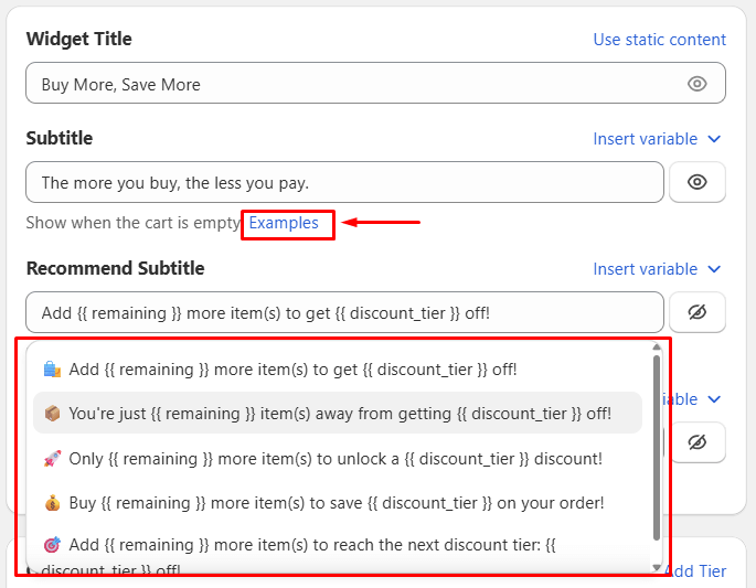
There are 2 modes of content display - static (by default) with only title and subtitle, and dynamic with the additional Recommend subtitle and Completed subtitle.
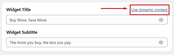
For Dynamic content, you can customize these content below:
Subtitle: Show content when the cart is empty.
Recommend subtitle: Show when the cart has items and message to encourage adding more items.
Completed Subtitle: Show when the cart matched the last tier.
You can also insert variables into each content box:
{{ min_tier }} - Show required quantity to unlock the next discount tier.
{{ discount_tier }} - Show discount value offered at the next tier.
{{ in_cart }} - Show current number of items in the cart.
{{ remaining }} - Show items needed to unlock the next discount tier.
For clearer illustrations, click Examples to view our content suggestions and use the preview pane to see how your configurations appear in the storefront.
1.3. Apply to Products
All Product
Select this to apply the offer for all products on your storefront.
Specific Product
Search for products to be applied with this offer by typing in the search bar or click the Browse button.
Custom Segment
Control which segments can receive the offer. There are 4 rules of custom segments and you can add up to 4 rules for a single Quantity Discount offer.
Product by tags
Select products based on specific tags (e.g. “sales”, “new”, “pro”)
Type a tag in the ‘Enter tag product’ bar. To add more tags, simply click the + button and type in more.
Logical conditions (dropdown):
Include all: Only apply for products that have all the entered tags.
Include any: Apply for all products that have at least 1 among the entered tags.
Exclude all: Apply all except for products that have all the entered tags.
Exclude any: Apply all except for products that have at least 1 among the entered tags.
Products type
Filter the products according to the product type (custom product categories e.g. Color lines, Sleeves color, etc.)
Logical conditions (dropdown):
Is: Apply for products that meet the entered type.
Is not: Apply for products that are not in the entered type.
Products by vendors
Choose products from specific vendors or brands.
Logical conditions (dropdown):
Is: Apply for products that meet the entered vendors or brands.
Is not: Apply for products that are not in the entered vendors or brands.
Products by collection
Target products that belong to specific collections.
Search for collections to be applied with the offer by clicking the Browse button.
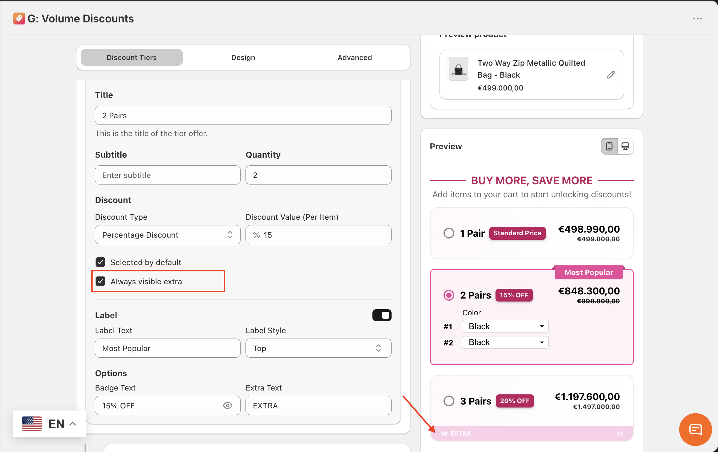
1.4. Offer Tiers
You can add unlimited discount tiers. The order of tiers on the widget follows ascending order (Tier 1 on the top, right below is Tier 2, Tier 3, etc.). You can also add or remove a discount tier.
Title: Add the title for the discount tier (e.g. Buy 2+ items, Buy 4+ items)
Quantity
Min quantity: Set the minimum quantity valid to this discount tier (e.g. 2). This is a required field.
Max quantity: Set the maximum quantity valid to this discount tier (e.g. 5). This is an optional field and you can delete it if not used.
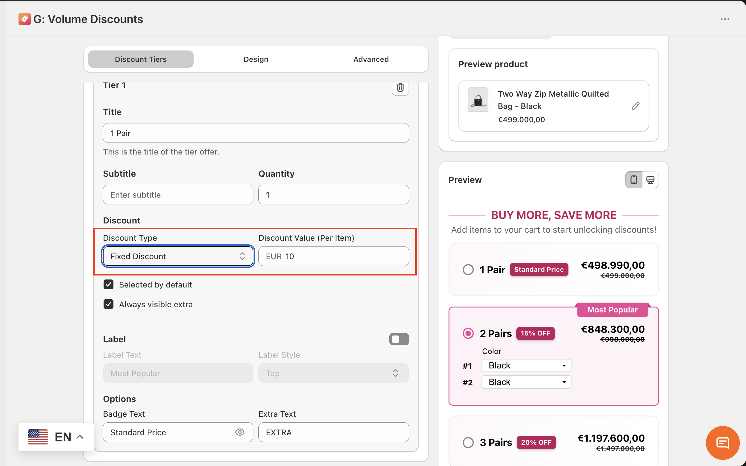
Discount
Discount type: Choose from 4 discount types and enter the discount value for each.
No Discount - The price is unchanged.
Fixed Discount - Discount only a fixed amount, the original price will be reduced by the discount value. (e.g. discount value: $5)
Percentage Discount - Discount on a percentage of the price (e.g. discount value: 10%)
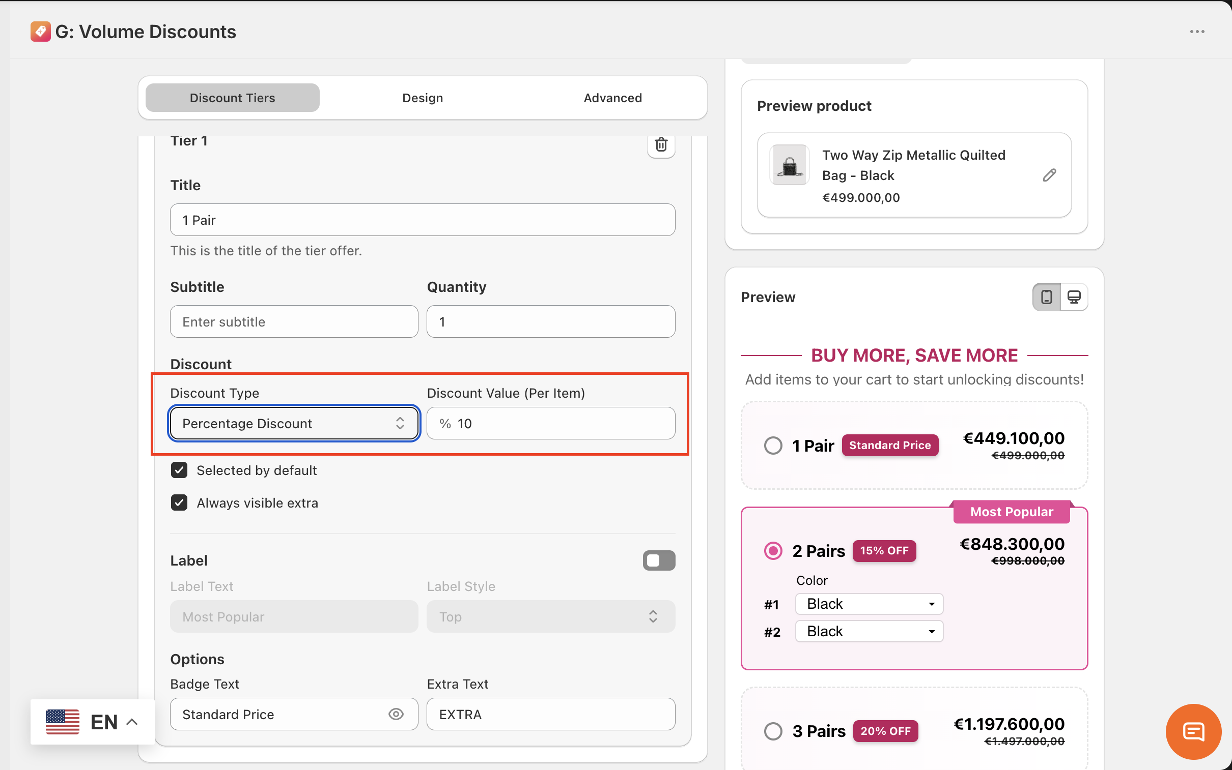
Fixed product price - Assign new price for the discount tier. (e.g. The original price for 1 pair is $5, when you apply the Fixed product price for a tier, the overall price for 2 pairs becomes $9 → Discount value: $9). Selected by default
Check on this box if you want this tier to be chosen by default. (when visitors first visit the product page)
Always visible extra
Check on this box if you want to show the extra tag on the tiers containing free gift, upsell, or both.
Check on this box if you want this tier to be chosen by default. (when visitors first visit the product page)
Always visible extra
1.5. Extra
Extra means the extra deals: Free gift, Upsell, or Mixed of these 2 types, Horizontal Layout by default; and we provide those ready-made templates for you to configure.
You can still add / remove any extra(s) no matter what template you choose at first.
Add extra(s) here.
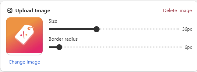
1.5.1. Add image
You can add an image at the offer tier, the image displays on the left of the tier title.
Upload an image / media in the following formats: gif, jpeg, jpg, png, webp, avif
Control the size and border radius (corner rounding) of the image: Slide to your desired value (image size - 36 px; border radius - 6 px)
1.5.2. Free gift
→ Give a bonus item to your customer (with selectable variants and flexible adjusted number of items). With a free gift offer, you can encourage trials for other products, cross-selling.
This creates a more engaging and flexible shopping experience that encourages higher-value purchases.
How to configure:
Click ‘Browse’ to find a product to be the free gift offer.
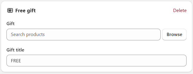
Adjust the number of the free gift items at the dropdown box. You can only add 1 product as the free gift.
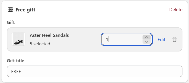
Gift title: Add the title of the free gift (e.g. Free)
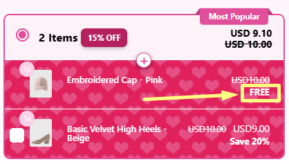
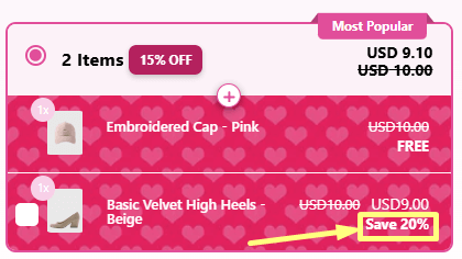
1.5.3 Upsell
→ Offer a discounted product or a complementary product to your customer (with selectable variants and flexible adjusted number of items). With an upsell offer, you can encourage cross-selling and increase cart diversity.
This creates a more engaging and flexible shopping experience that encourages higher-value purchases.
How to configure:
Click ‘Browse’ to find a product to be the upsell offer.
Upsell title (e.g. Save 20%)
Discount type: Configure similarly to the offer tier.
Selected as default: Automatically include the upsell product in the customers’ carts when they meet the discount tier.
Note: An Upsell product is optional. Customers can check the box on the upsell product if they want to buy the upsell combo and vice versa.
1.5.4 Mixed Free gift & Upsell
This template combines all benefits from Free gift and Upsell, which help you boost trials for other products, cross-selling, and increase cart diversity.
Free gift plus Upsell work better together than one alone. Buyers get a free item and a discounted upgrade. This makes them feel they win twice.
Overall, this creates a more engaging and flexible shopping experience that encourages higher-value purchases.
1.6. More Text Options
Footer
Enter text for the footer of the widget (at the bottom of the subtitle)
Example: *Offer expires on August 20, 2026.
Out of stock
Control the content of the out of stock notice, this content will be shown when the product is out of stock.
Example: Quantity exceeds stock. Available quantities may still be added to cart.
1.7. Customer criteria
How to configure:
How to configure:
Footer
Enter text for the footer of the widget (at the bottom of the subtitle)
Example: *Offer expires on August 20, 2026.
Out of stock
Control the content of the out of stock notice, this content will be shown when the product is out of stock.
Example: Quantity exceeds stock. Available quantities may still be added to cart.
1.7. Customer criteria
All customer
Select this for the offer to be available for all customers.
Custom segment
Login status
Apply the offer based on the login status of customers.
Choose between Logged in or Logged out.
Tag customer (Only for Logged in users)
Filter customers using custom tags (e.g., "VIP", "wholesale")
Logical conditions (dropdown):
Include all: Only apply for customers that have all the entered tags.
Include any: Apply for all customers that have at least 1 among the entered tags.
Exclude all: Apply all except for customers that have all the entered tags.
Exclude any: Apply all except for customers that have at least 1 among the entered tags.
Country
Filter customers based on their country of residence.
Search for countries and tick on what countries you want to apply this offer to.
Amount spent (Only Logged in users)
Target customers who have spent a certain total amount
Set the minimum and maximum spending limit of the customers for the offer.
Orders completed (Only Logged in users)
Target customers based on how many orders they’ve placed
Set the minimum and maximum number of orders completed limit of the customers for the offer.
Choose which customer types this offer applies to:
B2B Customers: Customers who belong to the store’s B2B catalog.Retail Customers: Regular retail customers.Both: Applies to both B2B and Retail customers.
2. Design configuration
Choose from design presets, adjust widget layout, setting colors for widget elements, and typography.
2.1. Layout
Adjust the layout of the offer blocks:
Vertical
Horizontal
2.2. Preset
We offer various ready-made presets for the discount widget to help save your time editing. The current preset on the preview pane is Pink Blossom.
2.3. Widget layout
Tier padding
Control the outer spacing of the tier text content.
Slide to your desired value. (e.g. 12 px)
Tier spacing
Control the spacing between tiers.
Slide to your desired value. (e.g. 4 px)
Horizontal padding
Control the width of all discount text content.
Slide to your desired value. (e.g. 8 px)
Vertical padding
Control the height of all discount text content.
Slide to your desired value. (e.g. 24 px)
Widget spacing
Control the spacing above and below of the widget.
Slide to your desired value. (e.g. 10 px)
Widget background
Control the background color of the widget with 4 color options.
None: Make the widget background transparent.
Color: Apply a solid color to the widget background.
Gradient: Click on the color icon to start customizing the gradient color.
Angle: Control the angle of gradient by sliding to your desired value.
Pattern: Choose from 150+ beautiful and practical patterns, including festivals: Valentine, Halloween, Christmas, etc.
Valentine, Christmas patterns
Halloween pattern
Tier background
Control the background color of the tiers.
Configure similarly to the Widget background.
2.4. Extra
Adjust the design of the offer tier’s extra tag when unselected (applied for offer tiers containing free gift, upsell, or both).
Extra background
Adjust the design of the offer tier’s extra tag when unselected.
Free gift background
Adjust the design of the offer tier’s free gift background when selected.
Discount background
Adjust the design of the offer tier’s discount when selected.
Upsell background
Adjust the design of the offer tier’s upsell background when selected.
Extra background, Free gift background, Discount background, Upsell background configurations:
Control the background color with 4 color options.
None: Make the background transparent.
Color: Apply a solid color to the background.
Gradient: Click on the color icon to start customizing the gradient color.
Angle: Control the angle of gradient by sliding to your desired value.
Pattern: Choose from 150+ beautiful and practical patterns. Including festival patterns: Valentine, Halloween, Christmas, etc.
Valentine, Christmas patterns
Halloween pattern
2.5. Widget colors
Widget border
Control the style of the widget border.
Width
Control the thickness of the widget border.
Slide to your desired value. (e.g. 0.5 px)
Radius
Control the corner rounding of the widget border.
Slide to your desired value. (e.g. 12 px)
Style
Control the style of the widget border.
Choose from the dropdown. Use the preview pane and see the icon of the widget border to adjust the widget appearance
Color
Adjust the color of the widget border.
Widget title
Adjust the color of the widget title.
Choose via the color picker or enter a HEX code (e.g. #FFFFFF for white)
Widget subtitle, Footer: Configure similarly to the widget title.
2.6. Tier colors
Border
Control the style of the unselected tiers’ borders.
See the 3.5. Widget colors for instruction to configure this field.
Selected border
Control the style of the selected tiers’ borders.
See the 3.5. Widget colors for instruction to configure this field.
Title
Adjust the color of the title.
Choose via the color picker or enter a HEX code (e.g. #FFFFFF for white)
Subtitle
Adjust the color of the subtitle.
Choose via the color picker or enter a HEX code (e.g. #FFFFFF for white)
Badge text, Badge background: Configure similarly to Title, Subtitle.
Sale price: Configure similarly to Title, Subtitle.
Compare price: Configure similarly to Title, Subtitle.
Regular price
Control the color of the price of the tier that has discount type = None.
Configure similarly to Title, Subtitle.
Label text, Label background
Control the color of the label in offer tiers containing extra (free gift, upsell, or both).
Configure similarly to Title, Subtitle.
Selected title, Selected subtitle / Variant, Selected sale price, Selected compare price, Selected regular price
Control the color of elements in the selected tier.
Configure similarly to Title, Subtitle of unselected tiers above.
2.7. Extra colors
Control the color of the extra tag when the offer tier is unselected.
Choose via the color picker or enter a HEX code (e.g. #FFFFFF for white)
Free gift title: Configure similarly to Title
Discount title: Configure similarly to Title
Upsell title: Configure similarly to Title
Text product
Control the color of the product name in free gift and upsell.
Configure similarly to Title
Quantity background: Configure similarly to Title
2.8. Typography
Format, choose 1 among 3 options: Bold, Italic, Underlined
Font family: Choose from 45+ available fonts
Font size: Slide to your desired value (e.g. 18 px)
Widget subtitle, Tier title, Tier subtitle, Tier badge, Tier label, Footer: Configure similarly to the widget title.
3. Advanced configuration
Adjust the offer price display, schedule and translation for multiple markets.
3.1. Price settings
Show price
This setting lets you choose to display what type of price on the discount tier.
Option 1: Show Total price
It is the total price of 1 discount tier.
For instance:
+ Tier 1 - Buy 1 pair. With a pair cost $18 → the total price for this tier is $18 x 1 = $18 → The widget shows $18
+ Tier 2 - Buy 2 pairs. With a pair cost $17 → the total price for this tier is $17 x 2 = $34 → The widget shows $34
Option 2: Show Per unit price
It is the price of 1 product on that discount tier.
For instance:
+ Tier 1 - Buy 1 pair. With a pair cost $18 → the per unit price for this tier is $18 → The widget shows $18
+ Tier 2 - Buy 2 pairs. With a pair cost $17 → the per unit price for this tier is $17 → The widget shows $17
Option 3: Show both prices
You will see a combination of total price and per unit price on each discount tier.
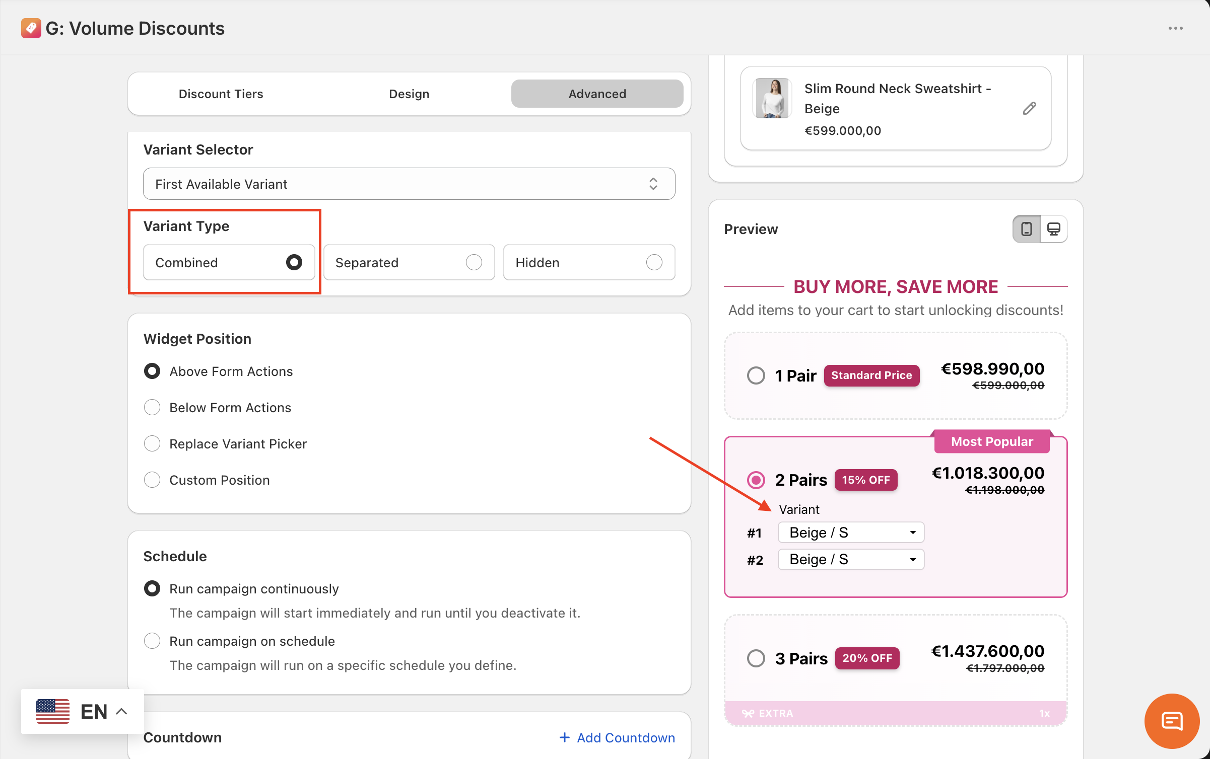
3.2. Variant Selector
Variant Selector
Choose how the product variants will appear in your offer.
Option 1: Combined
for products with multiple options (e.g. Size, Color).
Example: Size: S Color: Beige
Display: Variant: S / Beige
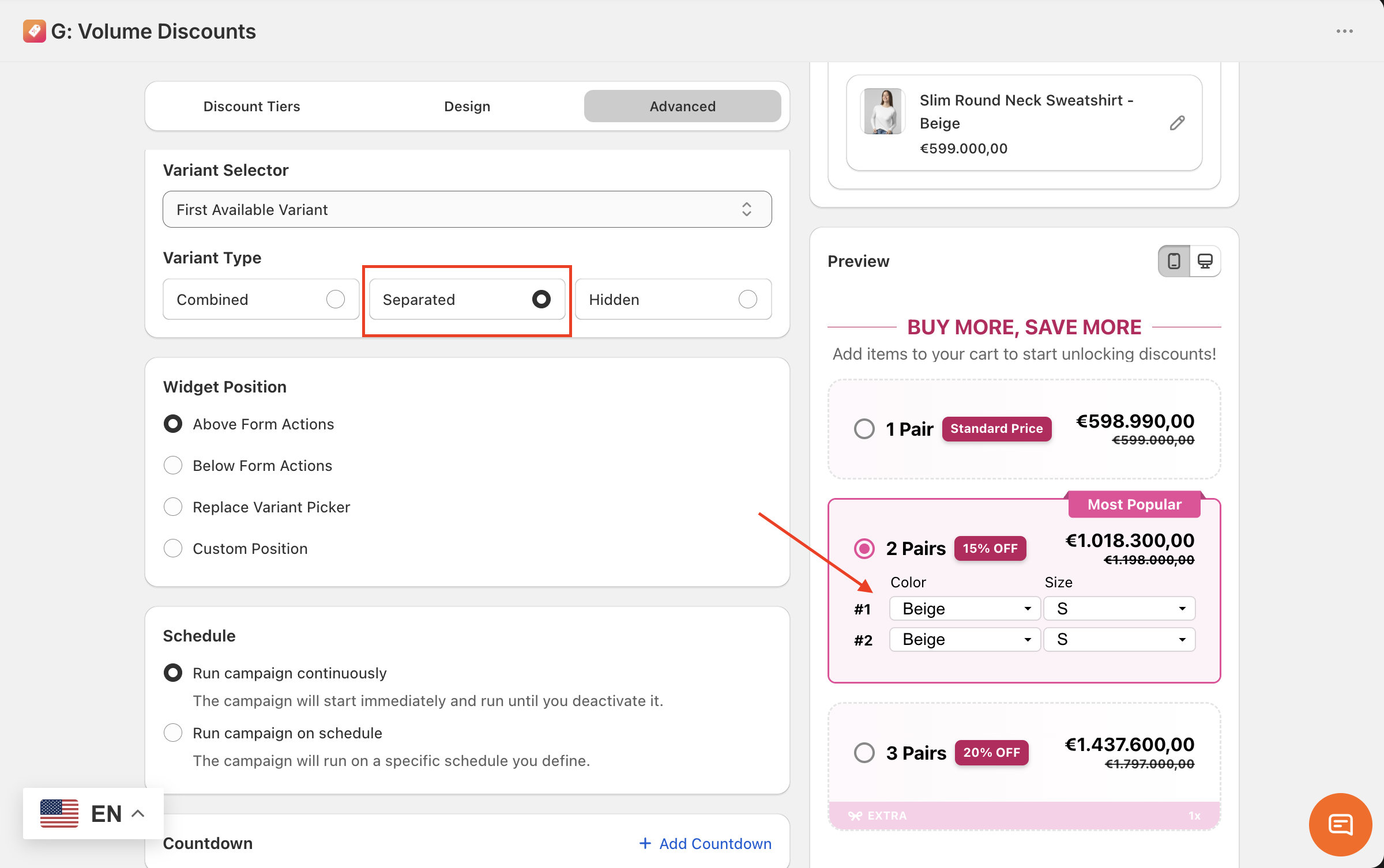
 Option 2: Separated
for products with multiple options (e.g. Size, Color).
Example: Size: S Color: Beige
Display:
Variant
Size: S
Color: Beige
Option 2: Separated
for products with multiple options (e.g. Size, Color).
Example: Size: S Color: Beige
Display:
Variant
Size: S
Color: Beige
 Option 3: Hidden
Hide the variant picker in the offer.
Option 3: Hidden
Hide the variant picker in the offer.
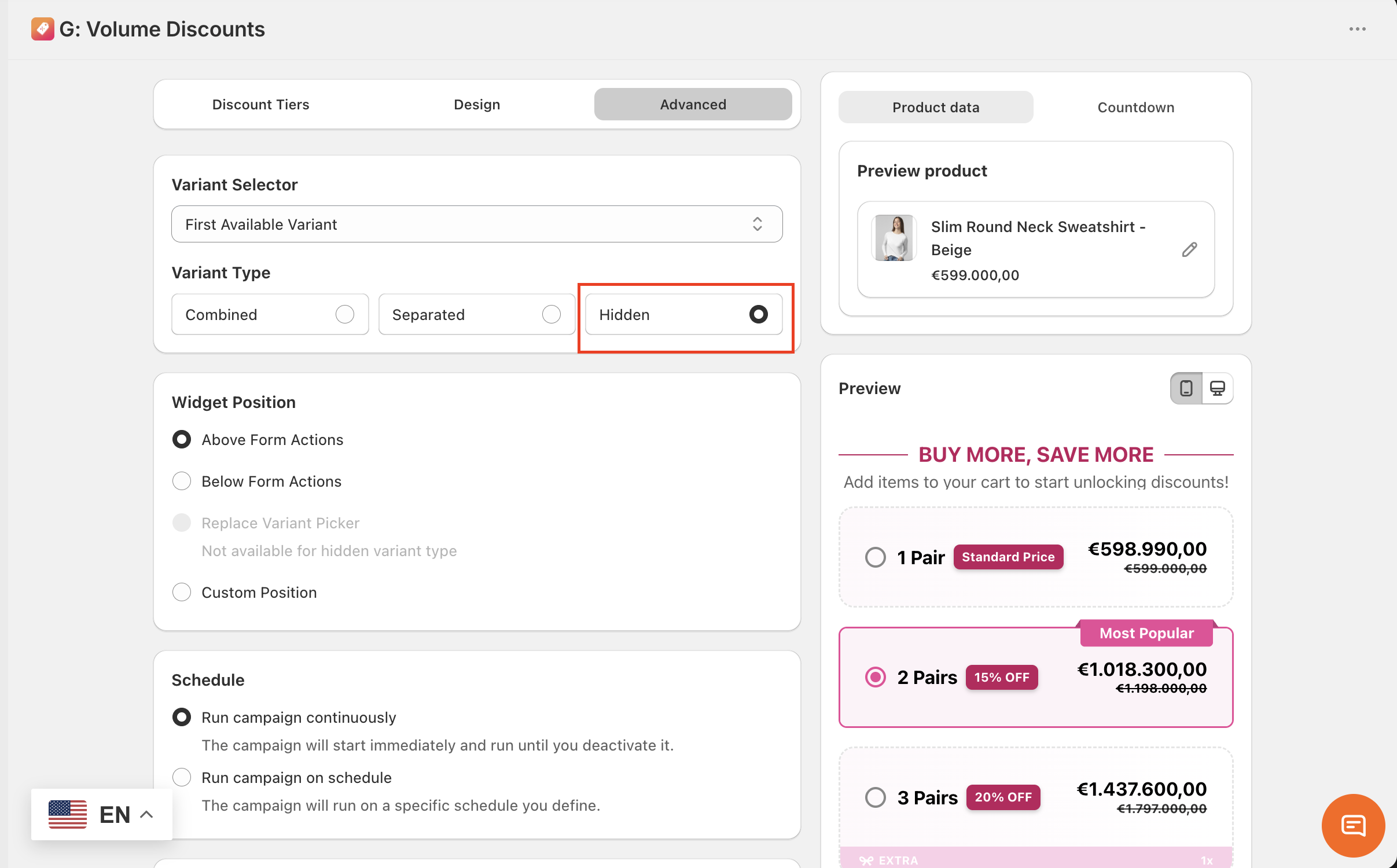 3.3. Widget Position
Choose where your widget will be appeared:
3.3. Widget Position
Choose where your widget will be appeared: - Above Form Actions: above the Add to cart button
- Below Form Actions: below the Add to cart button
- Replace Variant Picker: replace your theme default variant picker
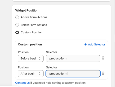
- Custom Position:
- Selector: Enter the CSS class of the element you want to target (e.g.,
.product-form).
- Position Options:
- Before begin: Places the widget outside and above the target element.
- After begin: Places the widget inside the target element, at the very top.
- Before end: Places the widget inside the target element, at the very bottom.
- After end: Places the widget outside and below the target element.
 3.4. Schedule
- Selector: Enter the CSS class of the element you want to target (e.g.,
.product-form). - Position Options:
- Before begin: Places the widget outside and above the target element.
- After begin: Places the widget inside the target element, at the very top.
- Before end: Places the widget inside the target element, at the very bottom.
- After end: Places the widget outside and below the target element.
Run campaign continuously
This option means the discount rule will start immediately and run until you deactivate it.
Run campaign on schedule
This option means the discount rule will run on a specific schedule you define.
Set the start date and start time. You can also set the end date and time.
3.5. Countdown
A countdown timer displayed directly in the discount widget creates a sense of urgency for customers, encouraging them to complete their purchase sooner.
To add a Countdown timer, please refer to this guide.
3.6. Translation
Language
Choose a language for translation of the widget content.
These are the languages published in your store. To manage or add more, click the here button. Type in your translation for this language. If you leave these fields unedited, the widget will show the default text as in the above image.
Start implementing these features today and watch your sales grow. The Tapita team is always ready to help, reach out for support to make the most of G: Volume Discounts & Free Gift here support@tapita.io
Related Articles
Set up your Quantity Discount and Volume Discount Offers
Boost sales for a single product or any products, boosting average order value (AOV), or clear excess inventory with ‘Quantity Discount’ Offer and ‘Volume Discount’ Offer in G: Volume Discounts & Upsell. They are designed to help Shopify merchants ...Table Layout Discount Widget in Quantity Discount and Volume Discount
The Table layout displays your discount tiers in a clear, structured table format. It provides the same functionality as the Stack layout while offering additional customization options in the Offer blocks and Design tabs, making complex tiered ...Set up your Frequently Bought Together Offer
What is Frequently Bought Together and Its Benefits? Frequently Bought Together (FBT) is a bundle widget that displays a curated group of related products directly on your Product Page, as a set customers can add to cart in a single click. Instead of ...Getting Started to G: Volume Discounts & Upsell
Introduction Struggle to boost your Shopify store’s average order value (AOV) or clear out excess inventory? Do your customers often abandon carts with only one or two items? G: Volume Discounts & Upsell is here to solve these worries. This ...How to Set Up Cart Progress Bar?
What is Cart Progress Bar? Cart Progress Bar is a widget that appears in your store's cart, showing customers a visual progress bar toward unlocking a reward, such as a percentage discount, a fixed amount off, or a free gift. As customers add more ...